The following chart from Trading Economics shows how Australian wages have risen by 58% over ten years.
That’s higher than House prices in Sydney rose for the same period, from the figures shown at this page.
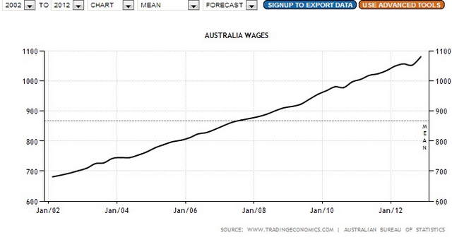
This was a very surprising result, as most people have thought that house prices far exceed wage rises.