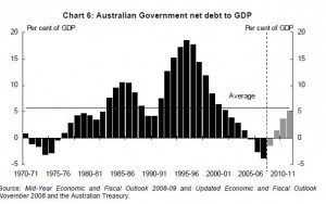
This graph shows the way that the Australian Governments Net Debt has moved, over the last 30 years, as a percentage in relation to GDP, and what it is expected to do in the next couple for years, following the reaction to the Global Financial Crisis.

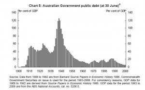
and then this one shows the Public Debt also as a percentage of GDP.

- Australian Government Public Debt to GDP
This information is sourced from “A History of Public Debt in Australia” at:
